Almost one year on from Google's mobile-friendly algorithm update, AKA Mobilegeddon, we take a look at the aftermath and why there's still time for you to convert to responsive web design if you haven't already.
Google introduced its mobile friendly update in late April last year (April 21, 2015) in response to the overwhelming increase in mobile internet searches. Mobile internet searches have exceeded desktop searches and as a result Google, understandably, wants to offer the best user experience and search results possible. In doing so Google's mobile friendly update is aimed at giving mobile friendly websites (ie. responsive websites) a boost in mobile search engine rankings.
The Mobilegeddon Aftermath
In the wake of April 21st many determined that much of the hysteria surrounding mobilegeddon was exaggerated and blown out of proportion but let's take a look at the figures. According to a study conducted by Stone Temple Consulting, 46.6% of non-mobile friendly sites experienced a drop in Google rankings following the update whilst 30.1% of mobile friendly sites gained rankings. The Adobe Digital Index also found that "traffic to non-mobile-friendly websites from Google mobile searches fell 12% in the two months after the changes took effect.” Although the changes may not have been as drastic as first anticipated, it’s clear to see they have had an effect on a lot of websites and with Google announcing another update to its mobile search results, which is set to roll out in May 2016, we can expect to see the effects reach further.
So Why Go Responsive?
Although it is a good one, Google's mobile friendly update is not the only reason why you should consider updating your website to be responsive. Responsive web design (RWD) brings with it a range of additional benefits which we'll discuss below.
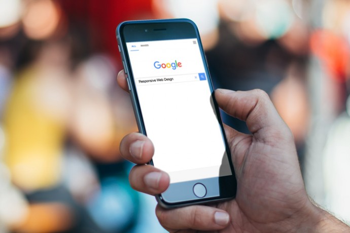
Better User Experience And Usability
On average people are spending over twice as much time online compared to 10 years ago which equates to over 27 hours a week. This means people are now spending more time on the internet than they are watching TV. One of the biggest reasons for this is the increase in devices we can access the internet on (desktops, laptops, tablets, smartphones and yes even TVs). To run a successful business and website it is crucial to cater for all of these devices and one way to accomplish that is through responsive web design. Responsive web design means a website will adapt and scale to fit the device it is being viewed on providing the user with the optimal viewing experience at all times.
Having Only One Website To Manage
Traditionally, to be mobile friendly, web designers would create multiple instances of a website each tailored to a specific screen size or device. This often meant you'd have to upload content multiple times which can be timely and inconvenient. A responsive website however, will fit any screen size meaning you only have to upload your content once saving you valuable time which can be used elsewhere.
Cost Effective
Another benefit of having a single responsive website over separate desktop and mobile websites is the cost. Having one website built will cost significantly less than two.
Increased Conversion Rates
Typically responsive websites receive a higher conversion rate compared to non-responsive websites. Generally this is thanks to the increased usability and arrival of new technology allowing people to access your website and services more frequently. Think about it, if your website isn't mobile friendly you’re neglecting a huge portion of users who browse the internet on their phones.
The Bottom Line
We've only touched on a few of the benefits of responsive web design and when you take into account the SEO benefits from Google it's hard see why you wouldn't convert to a responsive website.
If you have an existing website which isn't responsive and you're not quite sure where to start get it touch. We have years of experience developing responsive websites for a range of different businesses and if you're just looking for some free no obligation advice, then send us an email. We're always happy to help.